|
Proportion and
disposition of charges
It is when we
come to place charges on the shield that we have the greatest
possibility of producing something beautiful - or disastrous.
The charges themselves may be heraldic motifs, beasts and other
so called living things, trees and plants and, unfortunately,
"pictorial" arms. Each charge and its treatment would merit a
paragraph of its own but, for the present, the important
criteria are that each should be recognisable, properly
positioned and well-proportioned in relation to the rest of the
shield.
A few Golden
Rules concerning charges are:
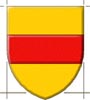
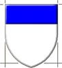
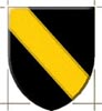
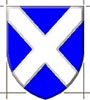
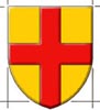
Aim to achieve
an "equality" of metals and colours. If a blue shield with a
white lion looks very blue, the lion is too small. The corollary
to this is that charges should be spread until they fill the
shield.
Use a certain
amount of distortion in order to fit the charges, especially
beasts and monsters, into the field.
When there are
three of the same charge, try the effect of making the one in
base a little bigger than the other two, but be careful.
Remember to use
exaggerations of the qualities of charges - the claws and teeth
of a lion, the beautiful curves of a fleur-de-lys, the prickles
of a thistle, the horns and ring of a bull (but not his teeth...
!) The fact that an inn-sign showing Warwick's bear and ragged
staff gave rise to the name "Pig-and-Whistle" is not a very good
recommendation for the heraldic artist concerned.
Colours, Metals
and Furs
Depending upon
the medium in which we are working, there will be a choice of
colours available commercially. In fact, we shall normally need
three colours for each heraldic tincture; the basic colour
itself, e.g. cobalt blue for azure, and two others - a pastel
version for highlights and a darker e.g. Oxford blue for
shading. How much shading you employ is a matter of your own
taste. On flags intended for flying, I use none at all except
where it is necessary to show, for example, the face and mane of
a lion guardant. A ceremonial banner, however, merits a little
more attention to the modelling of the charges.
Many artists
also vary the basic colours according to the other tinctures in
the design, or in order to achieve a certain "atmosphere". For
example, a deeper red may seem appropriate in ecclesiastical
armorial bearings. A special case arises in those rare instances
when the heraldic rules have been bent by the granting authority
and a colour is placed on a colour, or when a field is divided
and the result is two adjacent colours. Here, we may partially
overcome the problem by selecting a darker shade of one of the
colours and a lighter shade of the other, thus increasing the
contrast between the two.
As far as the
metals are concerned, most artists agree that silver is best
treated as white, whether one is working on paper, wood or
stone. There are few silver paints which give a good result, and
reflections often cause the shield to look odd. Imitation gold
paints, on the other hand, may give a pleasing appearance and
gold leaf, especially on a gesso base, can look superb.
It is my strong
opinion that a metallic effect should never be given to heraldic
f lags or banners of any kind; in fact, in many countries it is
the practice to blazon the same arms with gold for the arms and
yellow for the banner, or silver and white respectively. An
exception is found in Regimental colours, Girls' Life Brigade
colours and their like which may have battle-honours, badges or
lettering which can be executed in gold. I do not, however,
count these as real heraldry! Among the banners of the Garter
Knights at Windsor and the Knights of the Bath at Westminster,
there are many which have gold applied to their surface, but
they lack the liveliness which can be introduced by shades of
yellow and ochre.
Certain
ceremonial flags look well if made of materials which have a
certain satin sheen but even this should not be overdone.
The furs are
indicated by the presence of tails or, in the case of vair and
vairy, the special arrangement of blue and white, or other
combinations of colours. Each artist tends to develop a
favourite method of depicting these and, with rare exceptions,
one is always best to stay with what one draws best.
All your own
work
You may not be
a good artist, you may not consider yourself a good draughtsman.
It doesn't matter, as long as you amuse yourself. Never be
afraid to copy the greatest artists - You will find art students
doing this in almost any gallery - as long as you gradually
develop your own style.
You can always
remember, too, that the medieval heraldic artist was often not a
very good draughtsman either - that is precisely why this art
form is so stylised. When your design is finished, there is one
major criterion for judging its merit:
is it recognisable and does it identify its owner?
|