|
|
| |
Heraldic Arts - The Heraldry
Society of Scotland |
. |
| |
|
|
|
Heraldic Design -
The Basic Principles -
By Dr Patrick Barden |
|
|
|
This article which
appeared in the 1989 Double Tressure was a distillate of an
illustrated lecture given to the Heraldry Society of Scotland in
Edinburgh, 14th February 1989. It is intended for beginners of all
ages.
A small error in
the printing of the Society's winter programme led to the title of
this lecture being published as ". . . the basic principle*'. In
fact, this is not such a bad point from which to begin, for the
burden of my song today is that there is one over-riding principle
in heraldic design: arms, and all that goes with them, have the
primary purpose of identification. Clarity must therefore be the
first criterion of good work.
|

The Armorial Bearings of
The Late Dr Patrick Barden |
|
|
|
Identity
We use heraldry, or
armoury, to identify persons; their documents, their buildings, towns
and tombs. Such use of heraldry has resulted in two other, but
secondary, purposes: commemoration and decoration.
In the
commemoration of great occasions, both contemporary and historical,
or such everyday events as birthday's and retirements, We use the
colours and shapes of heraldry, not only on documents but also in
windows, sculptures and flags as eye-catching decoration. 'The
factor of identification, however, remains paramount.
The best size
I am going to begin
with a grin. Too much heraldry exhibited or displayed in Scotland
today is far too small, We may admire and applaud heraldry on
postage stamps but "postage-stamp" heraldry is much to be regretted.
Look at almost any sample of civic heraldry which you call meet on
the roads; as heraldists we want to see boundary boards and
welcoming signs which actually identify. At school, I was taught
that any poster put in a public place should be so designed that "he
who runs may read". With the speed of passing traffic today, a
roadside coat of arms needs to be simple - no mantling or other
frills - and the shield should be at least two feet high. In the
case of flags, there is an easy rule: estimate the size required and
double it. For some reason flags seem to disappear or become pocket
handkerchiefs when they are run up to the mast-head.
The best shape
for a shield
Shield shapes have
changed ever since heraldry began. In each Country there has been a
gradual evolution from one shape to another, often reflecting the
contemporary taste in other branches of' decorative art. It has,
however, been uncommon to find the same shape in vogue in several
countries at the same time. Today, if we look at the Fashion in
heraldry in different countries of Europe, we find that the heater
is in vogue in England, the Halbrundschild with a semicircular base
has been around in Austria and Switzerland for centuries and a form
of rounded shield with tapering sides is currently very popular in
Germany. The French, contrary to their usual taste for the
beautiful, have chosen to cling tenaciously to the ugliest shape of
all, an almost square and unrealistic, impractical shield. |
 |
|
Heater
|
|
 |
|
Halbrundschild
|
|
 |
|
Current
German
|
|
 |
|
Current
French
|
|
| |
|
You will all
be familiar with many different forms of shield and I will
show only a few examples, representing the extremes of
simplicity and decoration. It is generally agreed that, when
heraldry was born, the shield was almost triangular in shape.
Minor variations can be seen throughout the fourteenth and
fifteenth centuries. Later, heraldry became more and more a
paper art, though it was |
|
|
 |
still used in
architecture and other art forms; more quarters were added to
arms (particularly furth of Scotland) and the shield began to
take on some bizarre forms. By the late eighteenth and
nineteenth centuries the fashions current in public and
ecclesiastical architecture were reflected in curly,
over-decorative shields where the arms borne upon them are
almost irrelevant to the overall design.
|
 |
If you are in the
habit of drawing or painting arms, you almost certainly have one
or two favourite shield shapes; they suit your particular style
and you have become used to them. That is excellent and stamps
your work as surely as your signature. The only thing I would add
is that you should avoid mixing two or more shield designs in one
display and, if you are completing or repairing a set of shields
already in place, it is wise to copy as closely as possible the
style of the original artist.
How do we arrive
at an ideally shaped shield? I should like to suggest to you that
we approach this question from a consideration of the relationship
of the shield to the banner.
|
We shall
probably never know whether heraldry first appeared on shields
or on flags. What is certain, however, is that the truly
heraldic design was, and should be, transferable from one to
the other. It is for this reason that I recommend that, when
we begin a new design, we start with a shield which relates
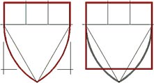
optically to a suitably proportioned rectangle. For example,
the classical "heater-shaped" shield, based on an equilateral
triangle and a chief of three by one, happens to relate
exactly to the square banner. We shall see how useful this is
later. |
 |
|
|
|
|
|
© The Heraldry Society of
Scotland last Update
27 Oct 2021 |
|
|
