| |
|
 |
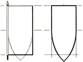
That shield
is, however, not very convenient for certain charges and
becomes very difficult to use for quartered arms. l would
therefore suggest that you try a variation which involves
shorter radii for the arcs which form the curve of the base,
the upper part of the shield consisting of a deeper
rectangle.
Such a
shield as I have drawn here (right) matches a rectangle
which is 9 horizontally by 10 vertically - a very happy
shape for a banner. |
 |
|
One thing I would
mention in passing is that the curve of the base is a curve,
preferably part of a circle; beware the shield with straight lines
in the point - very ugly.
Any banner which is
wider than it is high will relate to a shield of unsatisfactory
proportions and, ipso facto, must involve some distortion of
the heraldry it bears. The current British maritime flag, twice as
long as it is high, is totally unsuitable for heraldic
display. The stretching of the design (below, left) results
in a gross reduction of the proportion of the charges to the field.
The banner on the right resembles far more closely the arms shown in
the centre; it will also fly much better, if you think about it.
The forms of the
Royal Banner which are in current use also illustrate this
perfectly; the lion of Scotland ramps tiny in acres of tressured
gold and the leopards of England are each in desperate need of a
rollerskate amidships before they require treatment at the nearest
veterinary hospital. It is odd that people have been talking and
writing about this for decades, yet nobody at the Palace has ever
done anything about it.
Similarly, the
banner which is too high in comparison with its width will also
produce distortion, and I am not a subscriber to the opinion that a
banner should be twice as high as it is wide. Examples of such
ensigns do exist in medieval books of hours and other manuscripts,
but often involve a distortion of the arms. Look at the shield to
which it would relate, and you will see why.

There is one form
of shield that I have not mentioned: that granted to ladies. The
lozenge seems to passing out of favour, which is a pity, but it is
frankly an impossible shape for many coats-of-arms. Quarters become
either partly vacant or horribly distorted; and, if you try to draw
a chevron between three charges on a lozenge, you will soon become
convinced that the more popular ellipse gives more scope for good
design. In either case, however, you will find that the "related"
rectangle will be a help in your task.
Passing now to
consider the design we are going to place upon the shield or flag,
let us make absolutely sure that we understand the blazon. It is
more important to work from a blazon than from another drawing; such
a drawing may be a poor example to copy: it may already contain
errors, or we may introduce errors because we do not fully
understand what we are copying.
This applies not
only to charges which may have some special Feature (e.g. there is
supposed by some authorities to be a difference between the croziers
of an abbot and a bishop), but also to some divisions, ordinaries
and sub-ordinaries. Errors have frequently occurred between a chief
and a division per fess, or an inescutcheon and a bordure. The
similarity between an orle and an inescutcheon voided has even given
rise to a perpetual error, repeated in heraldic text-books for
nearly a hundred years.
Never, therefore,
accept a request to copy arms or make a flag without first seeing
the blazon. If you cannot read a blazon, now is the time to start
doing your homework.
Proportion within the shield
Having read the
blazon carefully, we know which ordinaries, subordinaries or charges
we have to put in our shield. We cannot change any of these but we
have a certain artistic licence which begins when we start to
dispose them over the available surface. The object of our efforts
now is to produce something which has balance and is pleasing to the
eye. I use the word balance advisedly because, whether or not the
arms we are designing are symmetrical, we should aim to achieve an
optical symmetry and an apparent equality of space in almost all
cases. It is now that you will appreciate the rectangle related to
the shield and also the squared paper. Let us look first at the
divisions of the field. Per pale
is nice and easy - straight down the mid-line of the shield.
Per fess and
per bend would be difficult to
measure but our rectangle gives us both without any problem.
|
